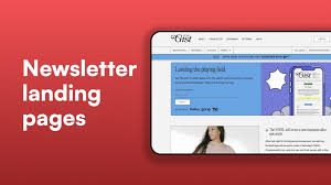
A good newsletter landing page clearly shows the value of signing up, makes it super easy to subscribe, and builds trust with potential readers. It’s the friendly handshake that welcomes people into your community.
What Makes a Newsletter Landing Page Shine
A newsletter landing page is basically a special webpage. Its whole job is to get people to sign up for your email list. Think of it as the front door to your email community.
It needs to be inviting and clear about what’s inside. Why does it matter so much? Because it’s often the first impression someone gets of your newsletter.
A great page means more subscribers. More subscribers mean a bigger audience for your message.
It’s where potential readers decide if your newsletter is worth their inbox space. If it’s confusing or doesn’t offer much, they’ll just click away. But if it’s clear, appealing, and promises value, they’ll hit that subscribe button.
This page isn’t just a form; it’s a promise. It tells people what they’ll get and why it’s good for them.
We’ll look at what makes a page like this work well. We’ll talk about knowing your audience and what they really want. We’ll also cover making the page easy to understand and use.
Plus, we’ll explore how to build trust so people feel good about giving you their email address. Getting this right can really change how many people join your list.
My First Newsletter Landing Page Disaster
I remember building my very first landing page for a newsletter. I was so excited! I had this great idea for sharing my photography tips.
I spent days writing out all the technical details. I used big words I thought sounded smart. The page looked okay, but it was a bit of a mess.
I put a long block of text about my experience.
I didn’t really think about what someone new to photography would want to know. I just assumed they’d want the same deep dives I did. I put the signup form way at the bottom.
I thought the amazing content would sell itself, so the page design didn’t get much attention. It felt cluttered and overwhelming.
After a week, I checked my stats. Zero new subscribers. My heart sank.
I felt a knot of panic in my stomach. What was I doing wrong? It was a humbling moment.
That’s when I realized content is king, but presentation and clarity are the whole kingdom. I learned that day that a landing page needs to speak directly to the reader, not just about myself.
Why People Click “Subscribe”
Understanding the “What’s in it for me?”
People sign up for newsletters for clear benefits. They want to learn something new, be entertained, or stay informed. Your landing page must highlight these benefits directly.
- Learning: Gain new skills or knowledge.
- Inspiration: Find ideas or motivation.
- Updates: Stay informed about topics they care about.
- Exclusive Content: Get special offers or behind-the-scenes looks.
Knowing Your Audience is Key
Before you even think about design, you need to know who you’re talking to. Who are the people you want to reach with your newsletter? What are their problems?
What are their hopes and dreams? What do they struggle with every day?
If you’re sending out gardening tips, are you talking to total beginners who kill every plant? Or are you talking to master gardeners looking for advanced techniques? The language you use and the benefits you highlight will be very different.
Knowing this helps you speak their language. It makes your message much more powerful.
Think about their age, their interests, and their level of knowledge on your topic. This isn’t about guessing; it’s about research. Look at online communities, forums, or social media groups related to your niche.
What questions are people asking? What are they complaining about? This gives you direct insight.
Use this knowledge to tailor your landing page copy.
Audience Insight Snapshot
Example: A Small Business Newsletter
Who: Small business owners, maybe a bit overwhelmed.
Needs: Practical tips, time-saving ideas, marketing help.
Pain Points: Not enough hours in the day, struggling with sales, unsure about online tools.
Desired Outcome: More customers, less stress, a growing business.
Crafting a Clear and Compelling Message
Once you know your audience, you can write your message. Your headline is the most important part. It needs to grab attention right away.
It should clearly state the main benefit of your newsletter.
Avoid jargon or overly fancy words. Keep it simple and direct. For example, instead of “Synergizing Omnichannel Marketing Strategies,” try “Get More Customers with Easy Marketing Tips.” See the difference?
One is confusing; the other is clear and appealing.
Your sub-headline can add a bit more detail. It can expand on the main benefit or introduce another key point. Follow this with a few short bullet points.
These should list the specific things subscribers will get. Make each point a clear benefit. For example, “Learn how to write emails that get opened” is better than “Email marketing best practices.”
The goal is to make it super easy for someone to understand what your newsletter is about and why they should join. Every word should work hard to convince them. If it doesn’t serve that purpose, cut it out.
Your message needs to be a clear, inviting invitation.
Headline Helper
Formula: +
- Good: “Free Marketing Tips for Busy Entrepreneurs”
- Better: “Grow Your Business: Weekly Marketing Secrets for Small Owners”
- Even Better: “Unlock More Sales: Your Free Weekly Guide to Effortless Marketing”
Focus on what they gain.
Designing for Simplicity and Trust
The look and feel of your landing page matter a lot. It needs to look professional and trustworthy. But it also needs to be simple and easy to navigate.
People are busy. They don’t have time to search for information.
Use plenty of white space. This makes the page feel less crowded and easier to read. Keep your design clean and uncluttered.
Use a limited color palette. Stick to colors that fit your brand. Good contrast between text and background is crucial for readability.
This is especially important for people with vision challenges.
Your signup form should be obvious. It shouldn’t be hidden. Make it prominent and easy to find.
Usually, this is near the top of the page or clearly visible. Keep the form short. Only ask for the essential information, like an email address.
Asking for too much can scare people away. Name is often okay, but anything more starts to feel intrusive.
Consider adding a clear call-to-action button. The text on the button should be action-oriented. Instead of “Submit,” use “Get My Free Tips” or “Join the Community.” Make it exciting!
The button should stand out visually, maybe with a contrasting color. This guides the visitor toward the desired action.
The Power of Social Proof
People are more likely to trust you if others do. This is called social proof. On your landing page, social proof can take a few forms.
One of the best ways is to show how many subscribers you have. Numbers can be very persuasive.
If you have thousands of subscribers, mention it! “Join over 10,000 readers who get.” This tells people that many others have found value in your newsletter. It reduces the risk for new visitors.
They think, “If so many people like it, it must be good.”
Another form of social proof is testimonials. These are quotes from happy subscribers. They should be genuine and specific.
A testimonial that says “This newsletter changed my business!” is good. But one that says “I finally understood SEO after reading Sarah’s weekly breakdown. It’s practical and easy to follow.” is even better.
Include the person’s name and, if possible, their photo or company. This adds credibility.
Social Proof Checklist
- Subscriber Count: Display the number of subscribers prominently.
- Testimonials: Feature 1-3 short, impactful quotes.
- “As Seen In”: If you’ve been featured in reputable publications, add their logos.
- Awards/Recognition: Mention any relevant accolades.
Build trust through others’ experiences.
What to Include in Your Newsletter Content Promise
Beyond just saying “sign up for my newsletter,” you need to be specific about the content. What kind of articles will they read? What topics will you cover?
What unique perspective do you bring?
For example, if your newsletter is about personal finance, you could promise “easy-to-understand guides on saving, investing, and budgeting.” Or if it’s a creative writing newsletter, you might promise “weekly writing prompts, editing tips, and interviews with published authors.”
Think about the different formats your content might take. Will there be links to helpful resources? Will there be actionable checklists?
Will there be Q&A sections? Mentioning these can make your newsletter sound even more valuable and engaging. This helps set expectations and ensures people know what they’re signing up for.
It’s also good to mention how often you’ll send emails. Are you sending daily, weekly, or monthly? Being upfront about this manages expectations.
If someone prefers daily emails, they’ll be happy. If they only want weekly updates, they’ll appreciate knowing your frequency. Consistency builds trust.
Making the Signup Process Effortless
The actual act of signing up needs to be as smooth as possible. This means a simple, functional form. We’ve touched on keeping it short.
But let’s go deeper.
Ensure your form works on all devices. Many people will visit your landing page on their phones. A form that’s hard to use on mobile will lose subscribers.
Test it yourself on different phones and tablets. It should be easy to tap buttons and type into fields.
Consider a clear confirmation message. After someone subscribes, they should see a thank you message. This confirms their action.
It can also tell them what to expect next, like checking their inbox for a welcome email. This reinforces the positive interaction.
Avoid unnecessary steps. Some systems might try to add extra confirmation emails. While useful for list hygiene, they can reduce immediate signups.
If your goal is maximum subscribers from the landing page, minimize steps. You can always clean your list later if needed. Focus on getting them in first.
Signup Form Best Practices
- Minimal Fields: Email is essential. Name is often second.
- Clear Button Text: Use “Subscribe Now,” “Get Your Free Guide,” etc.
- Mobile-Friendly: Test on various devices.
- Visual Appeal: Make it match your site design.
- Error Messages: Provide helpful feedback if something goes wrong.
Adding an Irresistible Lead Magnet
Sometimes, just promising a newsletter isn’t enough. People need a little extra nudge. This is where a lead magnet comes in.
A lead magnet is a freebie you offer in exchange for an email address.
It should be something valuable and highly relevant to your newsletter topic. For a gardening newsletter, it could be a “Printable Planting Calendar for Your Zone.” For a business newsletter, it might be a “Checklist for Launching Your First Online Course.” For a cooking newsletter, perhaps a “Collection of 5 Quick Weeknight Dinner Recipes.”
The key is that it solves a specific problem for your target audience. It should be something they can use immediately. Make sure the lead magnet is easy to access after they subscribe.
Deliver it via email or a download link on a thank-you page.
Clearly state what the lead magnet is on your landing page. Highlight its benefits. This gives people a very strong reason to sign up right away.
It transforms your landing page from “subscribe to my newsletter” to “get this awesome free resource and my valuable newsletter.”
Using Visuals Wisely
Images and graphics can make your landing page more appealing. But they need to be used thoughtfully. Don’t overload the page with too many pictures.
Choose visuals that directly relate to your newsletter’s topic or brand. For example, if your newsletter is about travel, use beautiful travel photos. If it’s about productivity, perhaps an image of a clean, organized workspace.
The visuals should enhance the message, not distract from it.
Ensure images are high-quality but optimized for web. Large image files can slow down your page loading speed. A slow page can drive visitors away.
Aim for a good balance between visual appeal and fast performance.
Consider using a graphic that represents the outcome of your newsletter. If your newsletter teaches people how to bake amazing cakes, maybe show a picture of a perfectly decorated cake. This helps people visualize the results they can achieve.
It makes the promise more tangible.
Visuals: Do’s and Don’ts
Do:
- Use high-quality, relevant images.
- Showcase the benefit or outcome.
- Ensure images load quickly.
- Maintain brand consistency.
Don’t:
- Overload the page with graphics.
- Use generic stock photos that don’t fit.
- Use low-resolution or blurry images.
- Use images that slow down your page.
Testing and Optimizing Your Page
Creating a landing page isn’t a one-and-done task. The best pages are constantly being tested and improved. This is often called A/B testing or split testing.
You can test different headlines to see which one gets more clicks. You can try different button colors or text. Maybe you want to test putting the signup form higher up on the page versus lower down.
You can even test offering different lead magnets.
The idea is to make small changes and see how they affect your conversion rate – the percentage of visitors who sign up. Use tools like Google Analytics or specific landing page software to track your results. Look at which versions of your page perform best.
Don’t be afraid to experiment. What works for one newsletter might not work for another. Data from testing is your best friend.
It tells you what your specific audience responds to. Small tweaks can lead to significant improvements in subscriber growth over time.
Real-World Scenarios for Newsletter Landing Pages
Let’s think about where you’ll typically find these pages. Often, they are standalone pages linked from social media bios. Or they might be a dedicated page on your main website, like “Get Our Newsletter.” Sometimes, they appear as pop-ups or embedded forms on blog posts.
For a blogger, the goal is often to capture readers who enjoy their articles. They might offer a newsletter with more in-depth advice or a weekly roundup of their best posts. The landing page would highlight the value of staying connected beyond just reading blog posts.
For an e-commerce store, a newsletter landing page might offer a discount code for first-time subscribers. This is a direct incentive to join. The page would emphasize savings and exclusive deals.
It’s a way to build a loyal customer base.
A service provider, like a coach or consultant, might offer valuable industry insights or tips. Their landing page would focus on establishing expertise and authority. They want to attract clients who value their knowledge.
The newsletter becomes a way to nurture leads.
Landing Page Placement Ideas
Website: Dedicated page (“yourwebsite.com/newsletter”)
Social Media: Link in bio (Instagram, Twitter, LinkedIn)
Blog Posts: End of articles or strategic pop-ups
Email Signature: A subtle link to your signup page
Online Ads: Directing traffic from paid campaigns
When is a Newsletter Signup Normal vs. Concerning?
It’s totally normal for people to sign up for newsletters. It’s a common way to get information and stay connected. A landing page with a clear purpose and an easy signup process is expected in today’s digital world.
When should you be concerned? If your landing page is misleading. If it promises something it doesn’t deliver.
Or if the signup process feels deceptive, like tricking people into subscribing. This can harm your reputation.
Also, be aware of spam laws. In the U.S., the CAN-SPAM Act provides guidelines for commercial emails. You must be transparent and give people an easy way to unsubscribe.
Your landing page should set the stage for good email practices.
If you’re seeing very low conversion rates despite having a good page, that might be a sign something isn’t connecting. It could mean your offer isn’t appealing enough, or your target audience isn’t quite right. Review your strategy if results are consistently poor.
Quick Tips for Better Newsletter Landing Pages
Here are some actionable steps you can take right now:
- Simplify your headline. Make it crystal clear what the benefit is.
- Shorten your signup form. Only ask for what you absolutely need.
- Use a strong call-to-action button. Make it stand out and clear.
- Highlight your lead magnet. Make its value obvious.
- Add a testimonial. Let happy subscribers speak for you.
- Check mobile responsiveness. Ensure it looks great on phones.
- Use plenty of white space. Make it easy on the eyes.
Fast Action Checklist
Review Your Headline: Is it crystal clear?
Shrink Your Form: Any fields you can remove?
Button Power: Is it noticeable and inviting?
Lead Magnet Love: Is its value obvious?
Frequently Asked Questions About Newsletter Landing Pages
What is the main goal of a newsletter landing page?
The main goal is to get visitors to subscribe to your email newsletter. It’s a dedicated page focused on convincing people to join your list by highlighting the benefits they’ll receive.
How short should a newsletter signup form be?
Ideally, very short. The absolute minimum is an email address field. Asking for a first name is common and usually acceptable.
Any more fields can decrease conversions.
What is a lead magnet, and do I need one?
A lead magnet is a free, valuable resource (like an ebook, checklist, or template) offered in exchange for an email address. While not strictly required, a good lead magnet significantly increases signups by providing an immediate incentive.
How important is the design of my landing page?
Design is very important. It needs to look professional, trustworthy, and easy to navigate. A clean, uncluttered design with good readability helps convert visitors into subscribers.
How often should I send my newsletter if people sign up via a landing page?
Be upfront about your sending frequency on the landing page. Whether it’s daily, weekly, or monthly, manage subscriber expectations from the start. Consistency is key to building a loyal audience.
Can I use the same landing page for all my newsletters?
It’s best to have specific landing pages for different newsletters or offers. A tailored page that directly matches the content or lead magnet promised will always perform better than a generic one.
How do I know if my newsletter landing page is working well?
Track your conversion rate – the percentage of visitors who sign up. Regularly review your analytics. If your conversion rate is low (e.g., under 2-5%), it’s a sign you may need to optimize your page elements like headlines, offers, or design.
Final Thoughts on Your Newsletter’s Welcome Mat
Creating a great newsletter landing page is about clear communication and building connection. It’s your digital handshake. Focus on your audience’s needs and clearly show them the value you offer.
Keep it simple, trustworthy, and easy to use.
Remember, this page is your invitation. Make it a warm and welcoming one that people are excited to accept. With thoughtful design and a clear message, you can build a thriving community around your newsletter.